Colour
Brand Colours
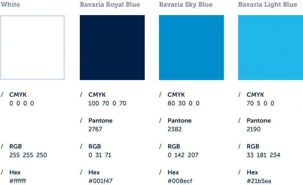
The brand colours mirror the character of the umbrella brand Bavaria. They should typically be the centre of the design. Casually said: “If I squint my eyes, Bavaria is a white-blue brand.”
Application of Brand Colours
The brand colours are in the centre of the overall colour tone and guarantee a strong impression of the umbrella brand Bavaria. The main component of the visual appearance is set in white. It should not only be the automatic paper colour, but used as a creative and planned space.

Resolution Main Colours
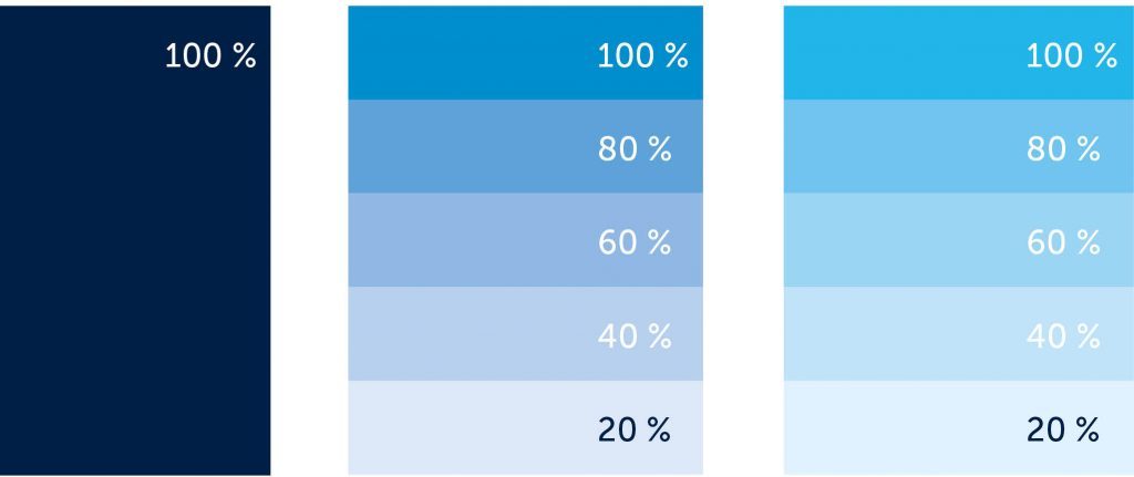
Bavaria Royal Blue can only be used as 100 % full colour. Bavaria Sky Blue and Bavaria Light Blue can be used in resolution steps of 20 %.

Emphasis Colours
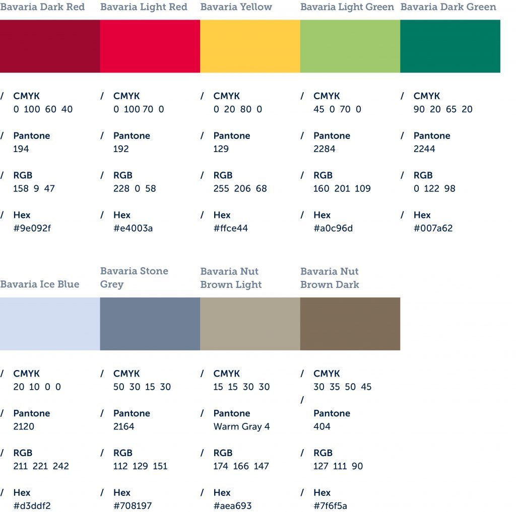
The umbrella brand Bavaria is as versatile as the state it represents. That is why there are emphasis colours available for a vivid design. They also give orientation in more sophisticated graphic systems, e.g., digital interfaces.
Please always be aware that these are secondary colours that typically, in combination with the picture, do not dominate the overall impression.

Resolution Emphasis Colours
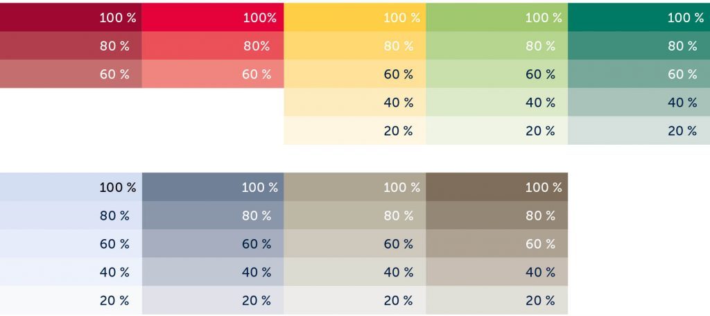
Emphasis colours may be used in 20 % step resolutions, e.g. in colour fonds or in diagrams. The red colours are excluded from this rule, they can only be used in 80 % and 60 %.

Colour Distribution
White space, brightness and affability are essential for the visual presence of the umbrella brand. Bavaria Royal Blue represents powerful contrasts and a confident presence – however, there should always be enough white space and brightness used in combination.

Depending on the picture (see e.g. inside pages), it can also be acceptable to use accent colours in larger spaces.