Layout and Composition
The Bavaria rhombus in a layout
Branding layouts are based on a flexible design system that is adaptable for almost all usages.
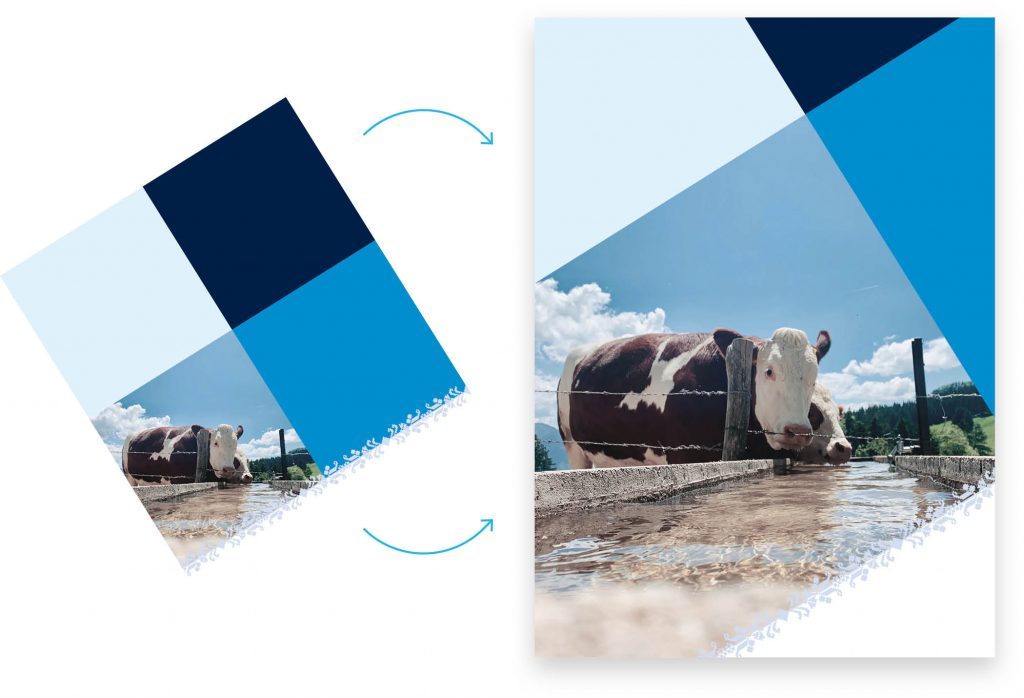
Basic principle diagonal framing
We reinterpret the characteristic Bavaria rhombuses from the flag: They cause a visual cohesiveness as a flexible layout system – and simultaneously offer enormous scope for individual appearances.
Technically, we work with a 4-zone system that is shifted to 32 ° (the angle is the Bavaria rhombus). It is consciously cut at the format edges. The 4 zones can be filled with different colours or colour variations and images.
Typically, we work with the brand colours and resolutions, completed by an image. Depending on the usage, e.g., inside pages or social media, it is also possible to work with 2 or 3 images. However, one zone needs to be a colour zone to keep the basic idea of the system.
Another popular option is a blank space outside of the 4-zone system which is often used for the logo placement and other design options.

Inflationary use of the 4-zone system is not desired.
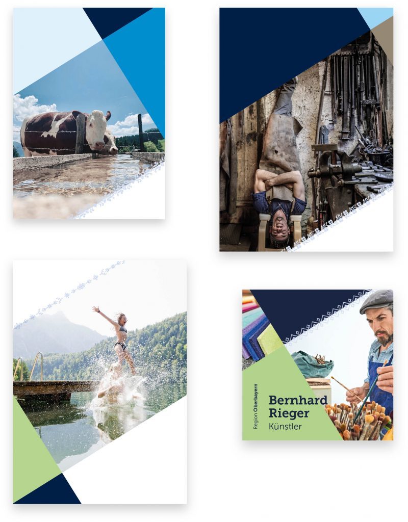
A flexible design system
You can find several examples in the templates which can be adjusted in a few steps to fit your communication purpose. Here, we demonstrate a few examples.

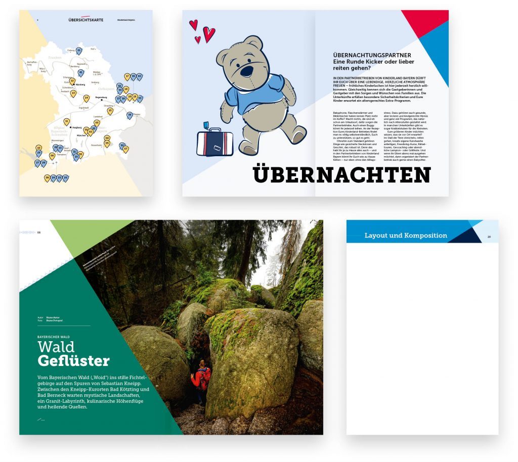
Further examples of the 4-zone system on inside pages

Room for the Logo
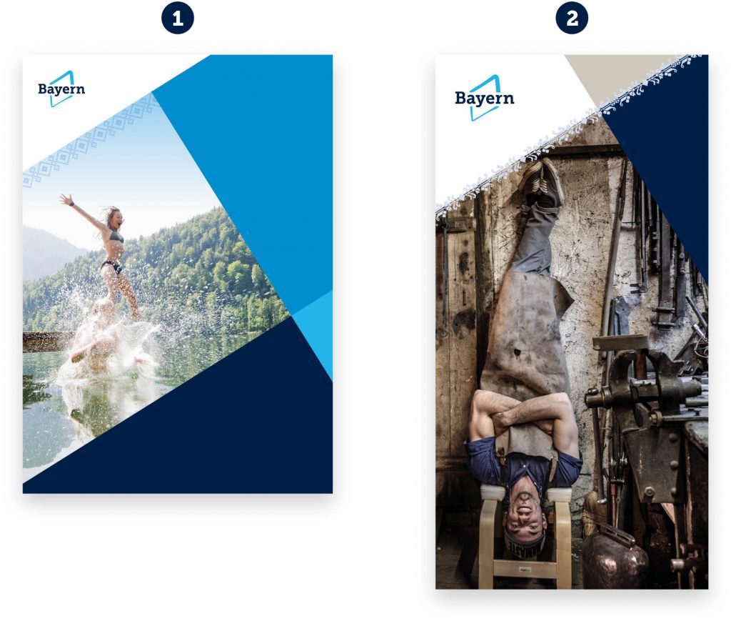
For a best possible effect for the umbrella brand Bavaria, the logo should always be placed on a white space.
There are two approaches:
1 – secluded from the tilted 4-zone system, there is a free space left specifically for the logo
2 – within the 4-zone system, there is one zone reserved for the logo
